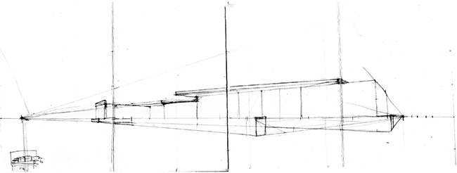
Most of the sketches were done on wirebound Stillman & Birn Beta Series sketchbook that I chose as one sole sketchbook to bring from home. The perspective panorama is on Sennelier Multimedia 340 accordion-fold sketchbook that was given to workshop participants. Thank you to both Symposium sponsors - both sketchbooks performed exceptionally well.
Life Between Buildings: Capturing the Energy with James Richards
Location: Plaça Catalunya, a large plaza where people gather, like an "outdoor living room".
Jim gave use three great exercises in composing crowds and buildings.
Drawing the crowd: I usually draw people, so this was fun to do. I used my usual Uniball Signo sepia pen and colored the balloons later. Putting peoples' heads align at eye line helps pull the scene together.
Thumbnails: I'm usually not great at drawing buildings, so sketching tiny scenes really helped me compose the drawing. I actually like these a lot more than the final sketch.
The final sketch, the one I don't like as much as the thumbnails: sketched onsite, colored on the plane ride home (which messed up the colors due to bad lighting), attempted to correct the color at home. I started sketching according to the rule of sketching non-moving things first (i.e. buildings) and people second. Imagine putting the crowd scene above inside this sketch, and you get the idea of how many people were really there. But I had to stop drawing the rest of the crowds and draw the man with lavender shirt and teal shorts before he walked off the page, because American men on the street back home will never, ever wear those colors together.
Lighting the City with Sagar Fornies
Location: Universitat de Barcelona, where our group was fortunate enough to sit under gracefully arched hallway when we were hit with an unexpected downpour (with thunder!)
I discovered that multiple ink colors and watercolors interact in unexpected and interesting results. I would like to try out more of this technique.
Barcelona Perspectives: Perceiving and Drawing Architecture with Arno Hartmann and Floria Afflerbach
Location: Barcelona Pavilion, a Modernist masterpiece by Mies Van der Rohe built in 1929
This is a beautiful building. And so hard to sketch.
For this workshop, I have measured the proportions to draw in perspective. I usually don't have the patience to draw buildings this precisely, so it was an exercise in really observing the subject - the building looks simpler to draw compared to the ornate buildings that is all over Barcelona, but this structure is much longer than I think, so I had to keep checking my drawing.

Setup, Value and Beyond with Matthew Brehm
Location: In and around Plaça Reial in Barri Gòtic
This time, I tried a media I haven't sketched with in years: pencil! I am very heavy-handed, so I smeared graphite all over the page, but Matt rightfully pointed out that this media allows you to get both the dark masses and lines quickly. He also has an excellent advise of never erasing, even in graphite - if there is a mistake, draw next to it so you have a reference to what you're correcting. Always move forward, never erase!
Walking around the narrow passageways of Barri Gòtic is like being in a medieval canyon, looking up and ahead for light openings and the sky. I could've sketched there for hours.
Triad Symphony: Evocative Watercolor Sketches Using Three Primary Colors
Location: Església de Santa Anna
This church had a small courtyard that our group can gather, and the light strikes this building very clearly, so it was an ideal place for this workshop. This is my first try at painting using only three colors, which made me think more in terms of value than just the local colors. I also like the idea of carrying fewer colors around, since I always end up carrying too much stuff when going out to sketch, so I tried the idea of limited palette at home... (there will be another post!)


6 comments:
Cograts Shiho! Excellents results in all five workshops! Waitinfg for more.
Thanks for posting, Shiho. Perswonally,I LOVE the last sketch you did for my workshop!
Lovely stuff Shiho. I especially like the purply blue and peach view out into the square. I think your final piece from Jim's workshop is great too, and I really like the way it has been coloured :-)
Oh beautiful!!! I love your drawings, and like Lynne and James, I love the colours on James' workshop. I also like the perspective drawing - really nicely done. Thanks for sharing!
Thank you, everyone! I struggled with a lot of exercises but I'm glad I learned a lot from all the workshops.
Great seeing you and nice capture of all the workshops and excellent results!
It's nice to see what took place on all the other great workshops I missed.
Post a Comment